Choosing the right colors for your home is one of the most powerful and most paralyzing decisions in interior design. Too many shades, too many moods, too many rules. That’s exactly why a color palette generator has become the secret weapon of both professional interior designers and savvy homeowners. Whether you’re redesigning a living room, refreshing a bedroom, or starting a full home renovation, the right tool can transform guesswork into genius.
In this guide, we’re going deep exploring what a color palette generator actually does, why color harmony matters in interior design, and how to use one like a professional to create spaces that feel intentional, elevated, and uniquely yours.
What Is a Color Palette Generator?
A color palette generator is a digital tool that creates cohesive sets of colors designed to work together harmoniously. Think of it as a personal color stylist one that understands color theory, mood, contrast, and visual balance without requiring you to have a design degree.
At its core, a palette generator takes an input a seed color, a mood keyword, an image, or even a design concept and returns a curated collection of complementary colors, complete with hex codes and styling guidance. The best tools go even further, suggesting how each color should be applied across walls, furniture, accents, and textiles.
Here at Decorateva, we built our own Free Color Palette Generator for Rooms, an AI-powered tool specifically designed for interior design use cases. You type in a room style or mood, and it returns five carefully matched colors with hex codes and room-specific styling tips. It’s fast, free, and tailored for real interiors.
Why Color Palettes Make or Break a Room
Before we dive into how to use a color palette generator, let’s talk about why color palettes matter so deeply in interior design. Color is not decorative, it is architectural. It shapes how a space feels, how large it appears, and how long you want to stay in it.
The Psychology of Color in Interiors
Every color carries an emotional weight. Warm neutrals like terracotta and sand evoke comfort and groundedness. Soft blues and sage greens bring calm and clarity. Deep charcoals and navy create drama and sophistication. Understanding this language is what separates beautiful rooms from forgettable ones.
According to color psychology research, the hues surrounding us can influence our stress levels, productivity, appetite, and sleep quality. This is why interior designers treat the color palette as the single most important decision in any project, it sets the emotional tone before a single piece of furniture enters the room.
If you’re curious how color choices translate into a finished bedroom, our article on Bedroom Color Trends in 2026 covers the exact palettes dominating modern interiors this year, from warm clay tones to cool mineral grays.
The 60-30-10 Rule: The Foundation of Every Great Palette

One of the most reliable frameworks in interior design is the 60-30-10 color rule. Here’s how it works:
- 60% dominant color: typically the walls and large furniture pieces
- 30% secondary color: sofas, curtains, rugs, and mid-size accents
- 10% accent color: throw pillows, artwork, vases, and decorative objects
A well-designed color palette generator will output colors that naturally respect this hierarchy giving you a dominant anchor shade, a complementary secondary tone, and a punchy accent that ties the whole scheme together.
Want to understand more ratio-based design rules? Our breakdown of the 3-5-7 Rule in Decorating is a fantastic companion read for building visually balanced interiors.
How to Use a Color Palette Generator for Interior Design
Using a color palette generator is only as powerful as the intention you bring to it. Here’s a step-by-step process for getting results that are actually usable in a real room, not just beautiful on a screen.
Step 1: Define Your Room’s Mood Before You Pick Colors
The biggest mistake people make is jumping straight to colors without anchoring the process in a mood or feeling. Ask yourself: how do I want to feel in this room? Energized? Serene? Sophisticated? Playful? These answers should guide every color decision you make.
On our Color Palette Generator, you can type something as simple as “calm coastal bedroom” or “moody maximalist living room” and the AI will interpret the mood and return a palette that matches. This mood-first approach consistently produces more coherent results than starting with a specific color you happen to like.
Step 2: Consider Your Fixed Elements
Every room has fixed elements flooring, architectural details, existing furniture you’re keeping, cabinetry. These are your non-negotiables, and your color palette needs to work with them, not against them.
Before generating a palette, note the undertones in your fixed elements. Warm wood floors pull toward amber and golden tones. White marble with gray veining pairs beautifully with cool grays and dusty blues. Terracotta tile anchors earthy Mediterranean palettes. Input this context into your generator for maximum relevance.
Step 3: Generate Multiple Palettes and Compare
Resist the urge to commit to the first palette you generate. Professionals always explore variations. Generate three to five palettes around the same mood, then lay them side by side. You’ll start to notice which colors appear consistently these are your anchors. You’ll also spot the outliers that give you an unexpected twist worth keeping.
Step 4: Test Colors in Real Light
Here’s a truth that every professional designer knows: colors on screens lie. Monitors display colors in RGB, while paint and fabric exist in the physical world under natural and artificial light. A pale blush that looks ethereal on your laptop may read as peachy-orange on a north-facing wall.
Once you’ve generated a palette you love, order physical paint swatches or print color samples and pin them to your walls. Observe them at different times of day morning light, midday sun, and evening lamp light will all shift the perception significantly.
Step 5: Map Colors to Surfaces
The final step is allocation, deciding which color goes where. Using the 60-30-10 rule as your guide, assign your palette’s five colors to specific surfaces and objects in the room. This transforms an abstract palette into an actionable design plan.
5 Stunning Color Palettes for Every Interior Style
To show you the power of a great palette in action, here are five mood-driven color schemes, the kind our generator produces mapped to specific interior styles.
1. Modern Minimalist: Warm White + Warm Gray + Soft Taupe
For spaces that breathe, this tonal trio creates a sense of serene sophistication. Warm whites on the walls, warm gray on upholstered pieces, and soft taupe in textiles and rugs. The palette is calm, editorial, and endlessly versatile. Add a single matte black accent, a lamp, a frame, a hardware detail to keep it from feeling flat.
Hex suggestion: #F5F0EB · #C9C0B5 · #A89880 · #6B5F54 · #1A1715
2. Warm Mediterranean: Terracotta + Sand + Warm White
Sun-drenched and grounded, this palette channels the warmth of southern Europe. Terracotta walls paired with natural linen, sand-colored cushions, and weathered wood furniture create a space that feels simultaneously rustic and refined. Layer in hand-woven textiles and ceramic accessories to complete the look.
Hex suggestion: #E07A5F · #D4A574 · #F2E8DC · #8B6551 · #3D2B1F
3. Moody Luxe: Deep Navy + Brass + Ivory
For those who design with drama, this combination delivers. Deep navy walls create an enveloping atmosphere perfect for a bedroom, study, or intimate dining space. Brass hardware and lighting add warmth and opulence, while ivory accents prevent the palette from feeling heavy. The result is a space that feels like a five-star boutique hotel.
Hex suggestion: #1B2A4A · #2C3E6B · #B8960C · #F5F0E8 · #8C7A5E
4. Scandinavian Calm: Sage Green + Off-White + Natural Oak
Hygge in color form. Sage green has become the defining shade of the 2020s Scandinavian interior revival, and for good reason it references nature, encourages calm, and pairs flawlessly with natural wood tones and linen textures. Use it on an accent wall or in full saturation for a bolder statement.
Hex suggestion: #8FAF8A · #C4D4BF · #F4F1EA · #C8A97A · #4A3728
5. Contemporary Glam: Blush Pink + Champagne + Charcoal
A palette that walks the line between softness and edge. Blush pink brings femininity without saccharine sweetness, especially when balanced with warm champagne gold in lighting and mirror frames, and grounded by a deep charcoal in upholstery or statement walls. This palette feels fresh, confident, and thoroughly modern.
Hex suggestion: #E8B4B8 · #D4A96A · #F7F0E8 · #5C5C5C · #2A2A2A
Room-by-Room Guide: Choosing the Right Palette
Not every palette works in every room. Here’s how to think about color selection based on the function and energy of each space in your home.
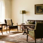
Living Room
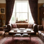
The living room is your home’s main stage, it needs to welcome, impress, and relax simultaneously. Opt for palettes with a warm dominant shade, a rich secondary tone, and a carefully chosen accent. Avoid palettes that are too cool or too monochromatic unless you’re going for a very specific editorial aesthetic.
For living room inspiration beyond color, our piece on How to Make Your Living Room Look Beautiful covers everything from furniture arrangement to lighting layering.
Bedroom
The bedroom calls for palettes that support rest and intimacy. Cool blues, muted greens, warm taupes, and deep jewel tones all work beautifully depending on your style. Avoid highly saturated or stimulating colors, bright reds, electric blues, and neon accents are energizing in theory, exhausting in practice.
For the latest expert-approved bedroom color directions, see our 10 Effortless Ways to Make Your Bedroom Look Nice, a roundup of timeless techniques that apply regardless of which palette you choose.
Kitchen
Kitchens benefit from palettes that balance hygiene and warmth. Crisp whites, warm creams, and natural stone tones are perennially successful. If you want personality, introduce color through cabinetry rather than walls, a deep forest green island or a dusty blue lower cabinet can transform a kitchen without overwhelming it.
Our deep-dive into Timeless Kitchen Interior Design Trends explores how color and material choices work together to create kitchens that age beautifully.
AI-Powered Color Palette Generators: The New Standard
Traditional color palette tools worked on simple color wheel mathematics complementary, analogous, triadic relationships. These are useful, but they don’t account for the nuances of interior design: the warmth of a room’s light, the texture of its surfaces, the psychological effect of its intended use.
AI-powered generators change the equation. By training on thousands of interior design projects, they can interpret natural language prompts and return palettes that respect not just color theory but design context. “A cozy reading nook with vintage vibes” produces a fundamentally different palette than “a sleek home office for a creative professional” and rightfully so.
Tools like Adobe Color and Coolors have set strong foundations in the web design world. But for interior design specifically where materiality, light, and spatial scale matter a purpose-built tool like our Decorateva Color Palette Generator is engineered for the specific challenges of decorating real spaces.
Common Color Palette Mistakes (And How to Avoid Them)
Even with the best tools, there are recurring mistakes that trip up even experienced designers. Here’s what to watch for.
Mistake 1: Choosing Colors in Isolation
Never evaluate a color on its own. Colors are relational a warm beige next to a cool gray will look orange. The same beige next to terracotta will recede into a neutral. Always assess your palette colors together, in the proportions you plan to use them.
Mistake 2: Ignoring Undertones
The most common reason a color “doesn’t work” in a room is undertone mismatch. Warm whites have yellow or pink undertones; cool whites lean blue or green. When you mix warm and cool undertones without intention, rooms feel unsettled and incoherent. A good palette generator will surface undertone information use it.
Mistake 3: Going Too Safe
An all-neutral palette is comfortable but can tip into forgettable. The magic of great interior color is in the tension a single bold accent that surprises and delights. Don’t let fear drive you into a beige box. Use your generator’s accent color suggestion with confidence; it’s there for a reason.
Mistake 4: Not Considering the Ceiling
The ceiling is the fifth wall, and it’s wildly underused in color design. A ceiling painted in a slightly deeper version of your wall color adds drama and intimacy. A crisp white ceiling amplifies light and height. Consider your ceiling as part of the palette from the start, not an afterthought.
How to Save and Share Your Generated Palettes
Once you’ve landed on a palette you love, documentation is everything. Here’s a professional workflow for capturing and sharing your color decisions:
- Save hex codes immediately: Copy all five hex codes into a note, a mood board app, or a design document. Hex codes are the universal language of color.
- Export the palette as an image: Our generator includes a Pinterest-ready PNG export, which you can save to a dedicated board for your project.
- Create a physical swatch reference: Print the palette image and pair it with physical paint chips and fabric swatches. Pin this to a board in the room you’re designing.
- Share with your team: Whether you’re working with a contractor, a painter, or a shopping partner, sharing the hex codes and swatch image ensures everyone is working toward the same vision.
Start Designing With Color Right Now
Color is the fastest way to transform a space. Not a renovation, not new furniture color. And with an AI-powered color palette generator at your fingertips, the process of finding that perfect combination has never been more accessible, more intuitive, or more inspiring.
Whether you’re painting a single accent wall or reimagining an entire home, the right palette is the difference between a room you tolerate and a room you love. Take the first step explore our free interior design tools, generate your palette, and let color do what it does best: tell the story of your space.